Data visualization
There are lots of different systems installed in our testbeds. A few of them are able to both collect, store and visualize data. Furthermore, collected data from all systems used in the testbeds can be made available in different offline datasets for enabling research and student related activities.
EcoStruxure™ Building Operation from Schneider Electric
This is our main building operation that allows us to manage the testbed, fix problems and also optimize the platform. Below you will find some visualizations extracted from the program.
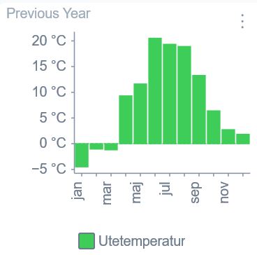
Image 1: Average outside temperature during 2019
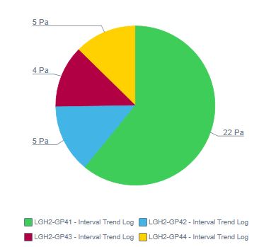
Image 2: Average pressure in 4 different sensors in one apartment
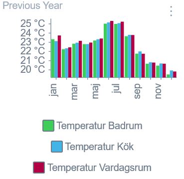
Image 3: Average inside temperature in one apartment during 2019 ( Green: Bathroom; Blue: Kitchen ; Red: Living room)
Wiser from Schneider Electric
Wiser is a product from Schneider that allows the tenants to control some features through their phone with the Wiser app. The app can for example can give tenants detailed information about exactly where electricity is being used.
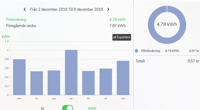
Image 4 : Electricity usage for one week in December for one apartment. It also shows the difference between the week before and the costs for the amount of electricity used during that same week.
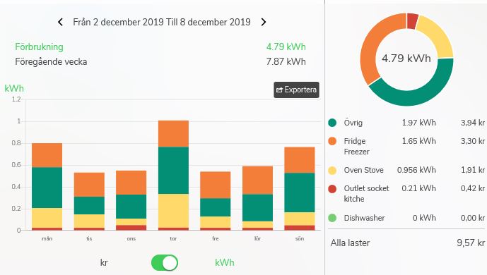
Image 5: Specific electricity usage per utilities for the same September week.
FM Mattsson (operated through Telia IOT)
In the Testbed KTH we have FM Mattsson water taps that are digitally connected to an online platform that register the usage for every apartment and for different water utilities.
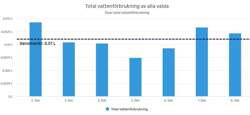
Image 6: Average water usage for one apartment during one week in December 2019 (Genomsnitt: Average)
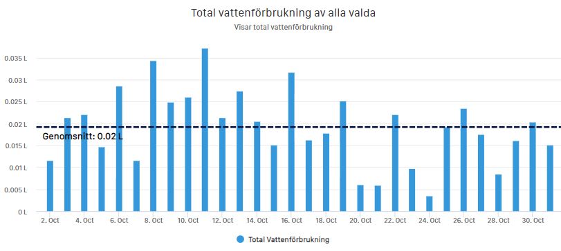
Image 7: Average water usage per day for 4 apartments during October 2019
Microsoft Office- Excel
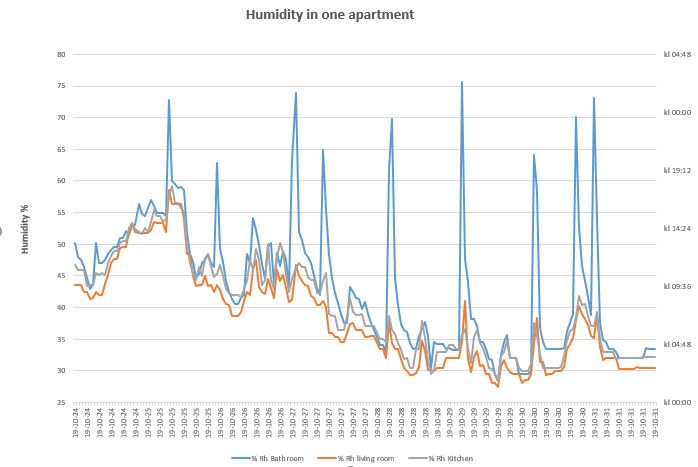
Image 8: Graph from excel list presents humidity percentage for one week and per hour.
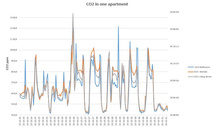
Image 9: Graph from excel list presents CO2 levels for one week and per hour.